Blog

Project Showcase : Rafay Systems

A post by:

Rafay Rebrand Project

How do you elevate a company’s brand? Well, you call me, of course. 😉  Self-aggrandizing aside, I had the opportunity to help Rafay, with their rebrand project. Rafay is an enterprise AI and cloud services company specializing in accelerated computing infrastructure. The Marketing team wanted a rebrand; technically, it’s a brand refresh, but we updated a lot of things nonetheless. Here’s a breakdown of all the projects for this new rebrand project launch.

Rafay rebrand project

A bit about Rafay and the project…

Rafay was founded in 2017 and has scaled remarkably fast in recent years, forming some recent partnerships with NVIDIA and Cisco, among others. The company has indeed grown, and the opportunities are numerous. So, it’s a perfect opportunity to make some noise with the brand.

The one directive I received from the team was that they wanted to establish the concept of “elevate” as a cornerstone of the rebrand. And don’t touch the logo. But everything else was open for a refresh.

We explored various creative directions, and ultimately, we focused on the concept that shows how Rafay elevates your project. We aimed to find the most effective way to communicate that.

The brand & creative projects

A bit of background on the brand, the CEO had the logo created for the company, and there’s a cool story about it. Rafay is of Arabic origin and means “to elevate” or “to raise.” Therefore, the logo symbolizes elevation, scaffolding, and building toward new heights.

The Rafay “R” logomark, or the “scaffolding” (as it’s named internally), symbolizes building, scaling, and support. While that was the intended meaning, the execution of this idea was not quite clearly communicated.  

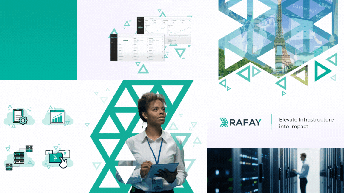
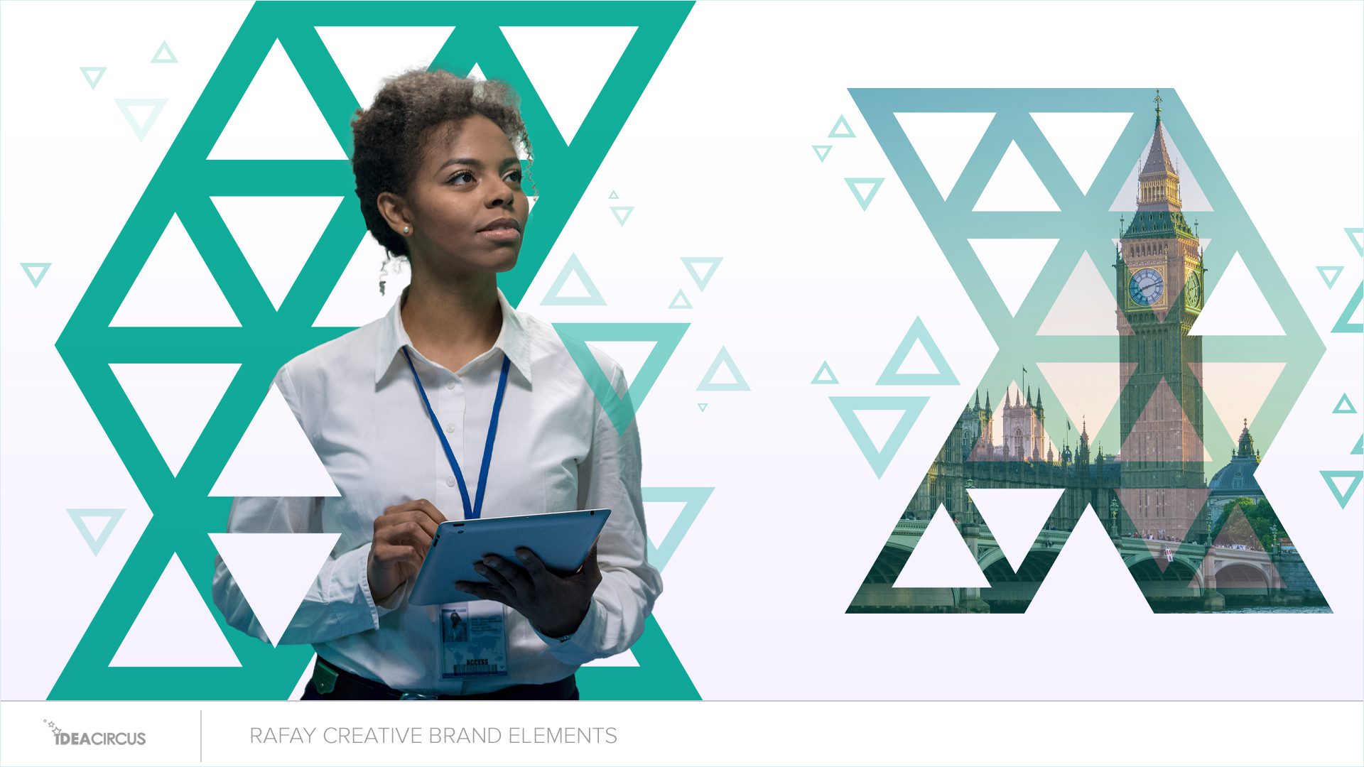
The idea of how Rafay powers infrastructure led to concepts of structure, architecture, and landmarks. Since Rafay is a global company, landmarks from around the world were an obvious choice. 

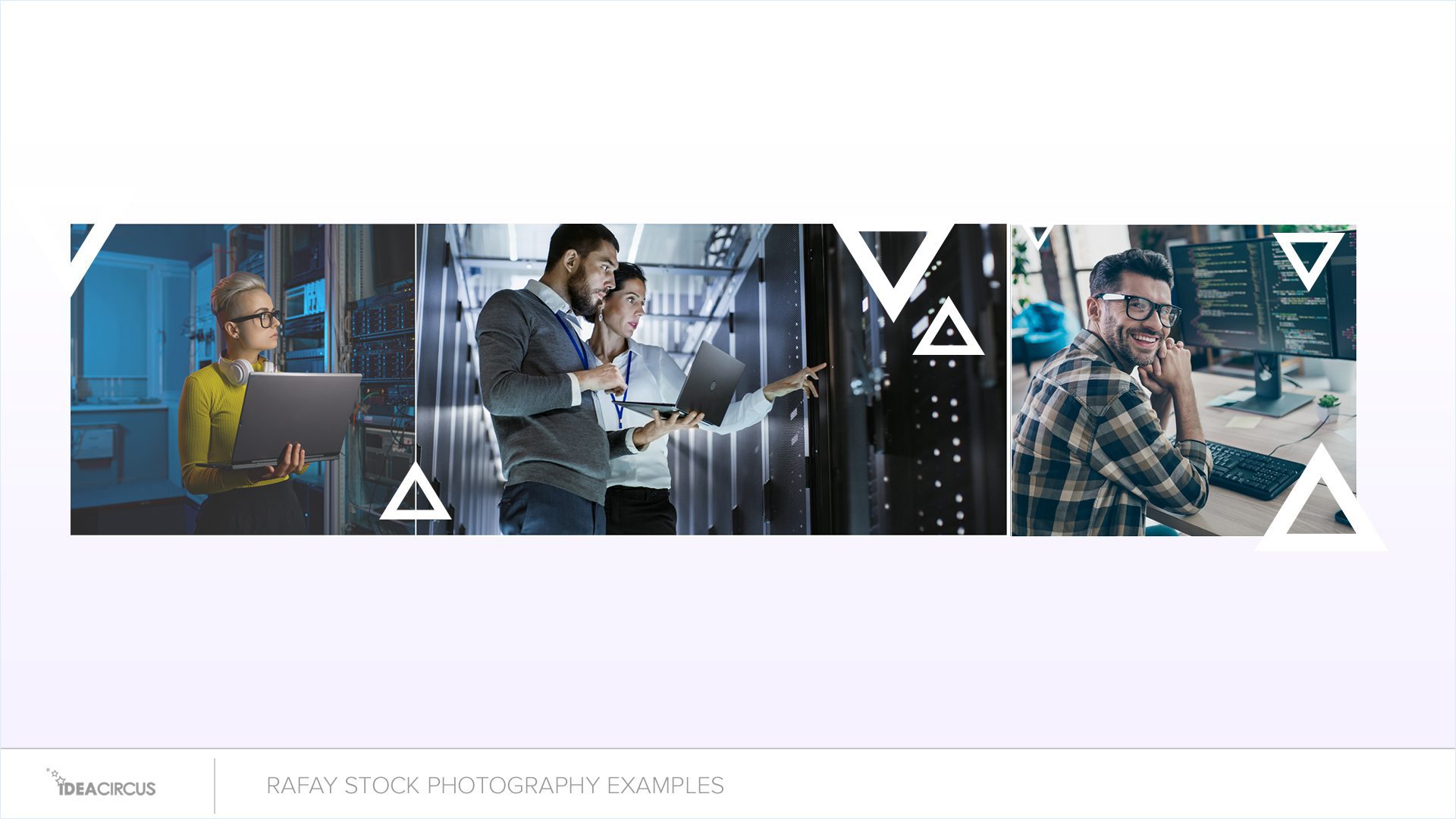
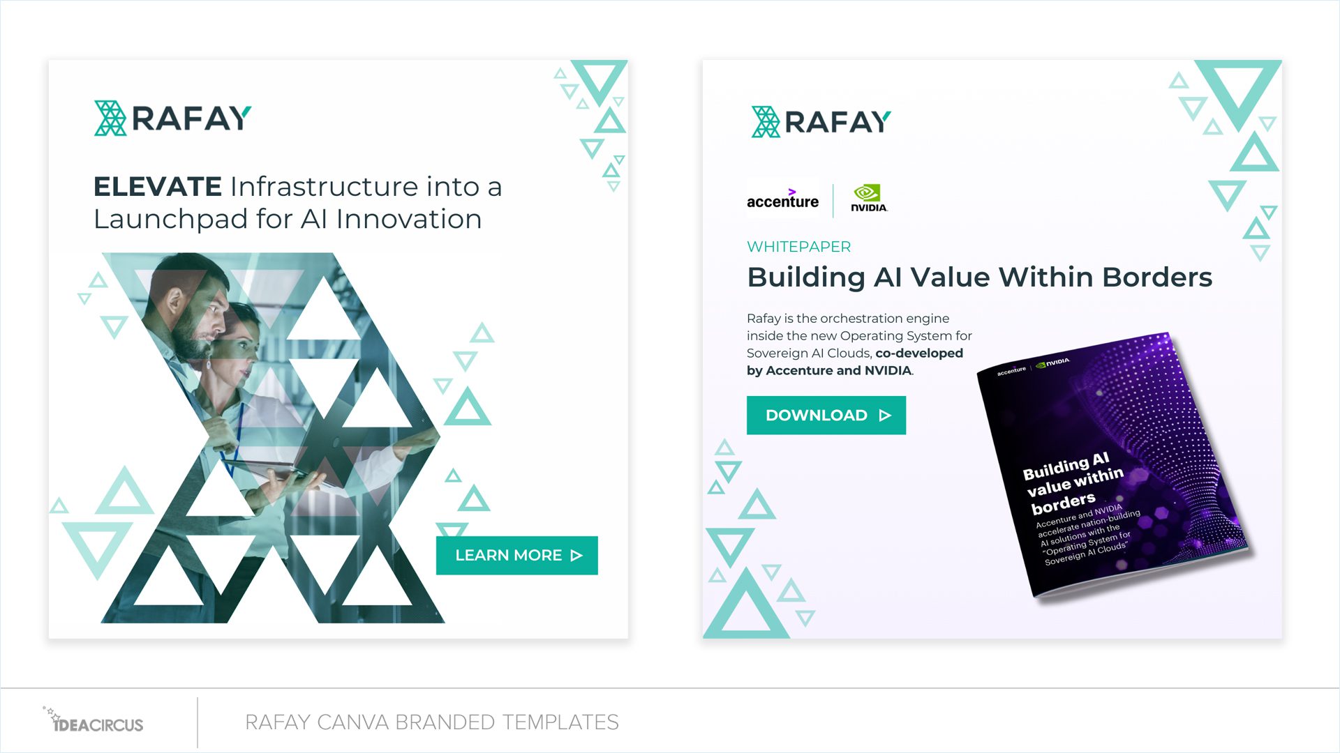
Capitalizing on the activity of “building”, we’ve broken down the logo and used its triangle shapes as brand elements, as you can see throughout the company’s communications.

The logo mark is the foundation of the brand visuals. I deconstructed the logo and used its triangle shapes as brand elements. I used triangles in progressive transparency, as they elevate from the main logo mark. They float away from the “R” seen below.


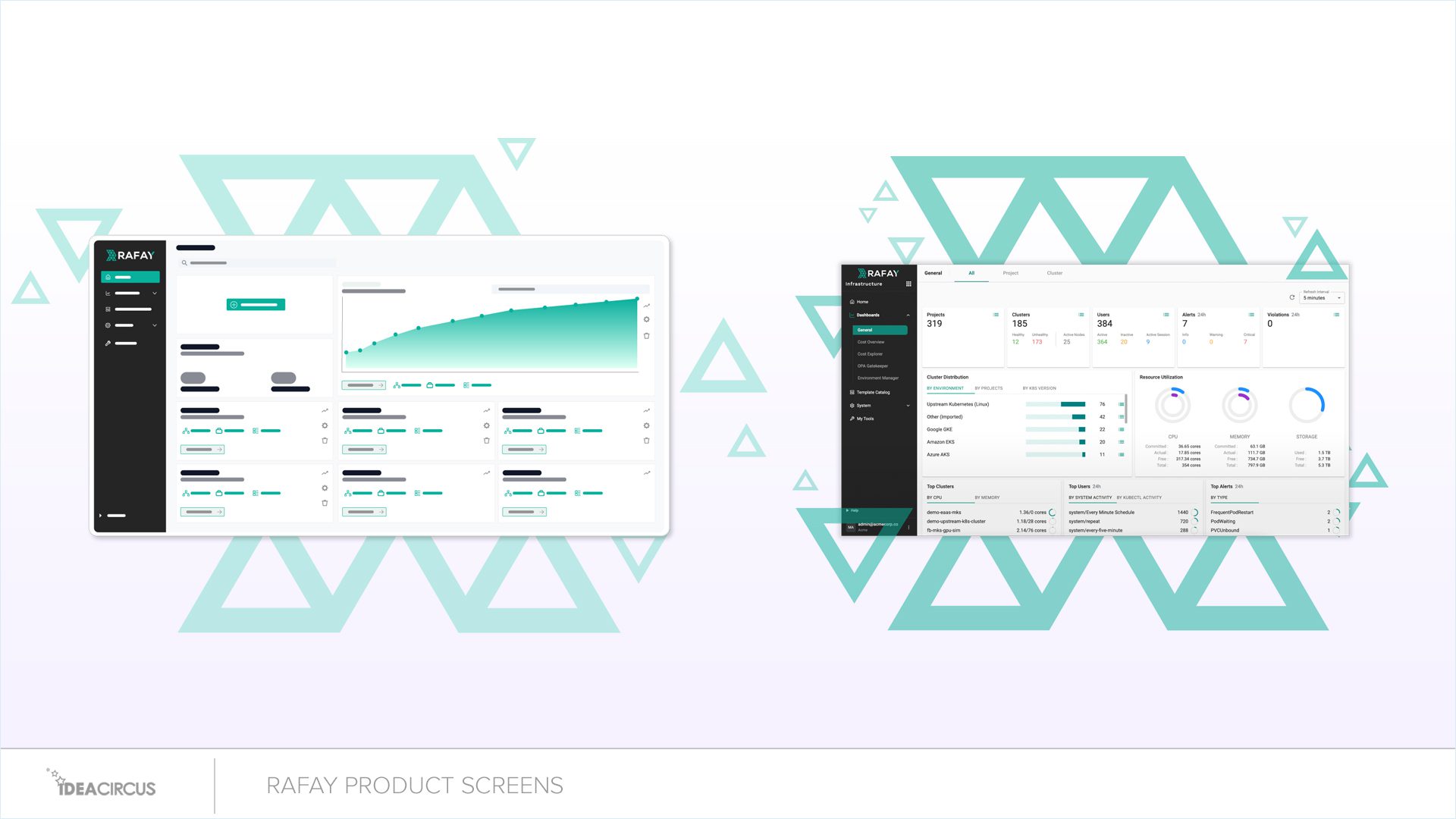
We used the logo mark as an anchor for photography mock-ups, hero images in the website and many other uses.


RAFAY CREATIVE BRAND ELEMENTS

The Website

The site was visually considered too dark, and the goal was to brighten it overall. A lot of dark colors and shades were used throughout the site. I chose a brighter color palette and removed all dark colors from the site and the brand.

RAFAY WEBSITE EXAMPLES

Video, Motion & Animation

For the Rafay website and its hero treatments, utilizing the R scaffolding is the key design element throughout the site. The “elevated” triangles seem to invite motion and animation as they drift up and away from the key shape. It’s a nice visual.

Rafay Logo animation

Brand Photography

We needed visuals of the actual customers in their environment—specifically, the people who work in the trenches of large server systems and cloud storage rooms. The photography conveys that, and what’s nice is that it can scale with any future stock photography.

RAFAY STOCK PHOTOGRAPHY EXAMPLES

Brand Icons

Clean and clear. The icons showcase a consistent style that relies on line art and color blocking.

RAFAY ICON EXAMPLES

Product Screenshots

I made a silly video about marketing screenshots here. But honestly, you need to market a product—and do so visually as well. If your screenshots look like a developer’s GitHub toolkit, without any style, then building the screens into brand elements helps tell that story. So, remember, product marketers: get your screenshots right, like this.

rafay product marketing screenshots

Future proofing a rebrand – at least the creative production part of it…

We created a practical brand library and designed templates in Canva. Since small businesses often can’t afford full-time design staff, Canva offers an affordable way for marketing teams to produce visuals in-house with minimal effort. As a result, Canva templates were the clear choice. Love it or hate it, Canva is here and widely used. With my experience as an in-house designer and leading design teams, I understand how difficult it can be for marketing teams to create visuals on their own.

RAFAY CANVA BRANDED TEMPLATES

Some Cutting Room Floor reveals and some messed-up GenAI Images?

We explored many ideas during this rebrand, really putting my Midjourney Gen AI skills to the test — and having quite a few laughs along the way. Here are some prompts that didn’t quite hit the mark.

Need help with your next big idea?

Contact me to see how I can assist your team in building your next brand or marketing project. I’ll ensure we launch on time and within budget, leveraging my experience to make the process smooth and stress-free for you. Contact me to find out how Contact us to find out how.

Creative can be a circus. Let me help.

Cheers
Greg
Idea Circus 💡 🎪

We're very social.

Not “Influencer” social,.. but social enough.

Hey Marketing Nerds… I made a Brand Funnel.

Hey Marketing Nerds… I made a Creative Brand Funnel.

There are all kinds of funnels. Funnels for your oil. Funnel cake, and then there are Marketing funnels. Why funnels? Product and Marketing have silly names for ecosystems and tech stacks. “Marketecture” should also be included in the silly category of Marketing speak. But that’s another blog post entirely.

Read More »